Re-Editing Old Photographs for a New Look.
This weekend the weather at home has been uninspiring, and after a long week at work rest felt like the best solution. I used some of that time to sort through memories and found a few photographs I thought would be interesting to re-edit. In the past few months, I’ve been using a few presets by Emmett Sparling that’ve made editing far more enjoyable and the results more consistent. His goal in developing them was to create timeless edits - a look to photos that would stand the test of time rather than fit a current trend. Over the past few years, I’ve been trying to work toward consistency in editing my photos with variable success. It became frustrating and I was losing interest in editing because of frustration. This year, however, these presets have taken the stress out of editing and helped me find interest in it again. The goal for me is to produce the end product but also to enjoy the entire process. These aren’t one-click edits, but the preset gives me a great base to start and a consistency of the colors in the work. I’m sure that over time, my style will continue to adapt and mold into something new, but for now, this style of editing has taken stress and time out of editing and put more enjoyment into taking photographs.
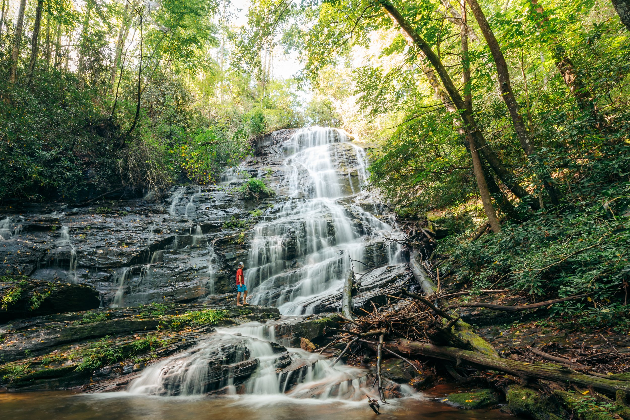
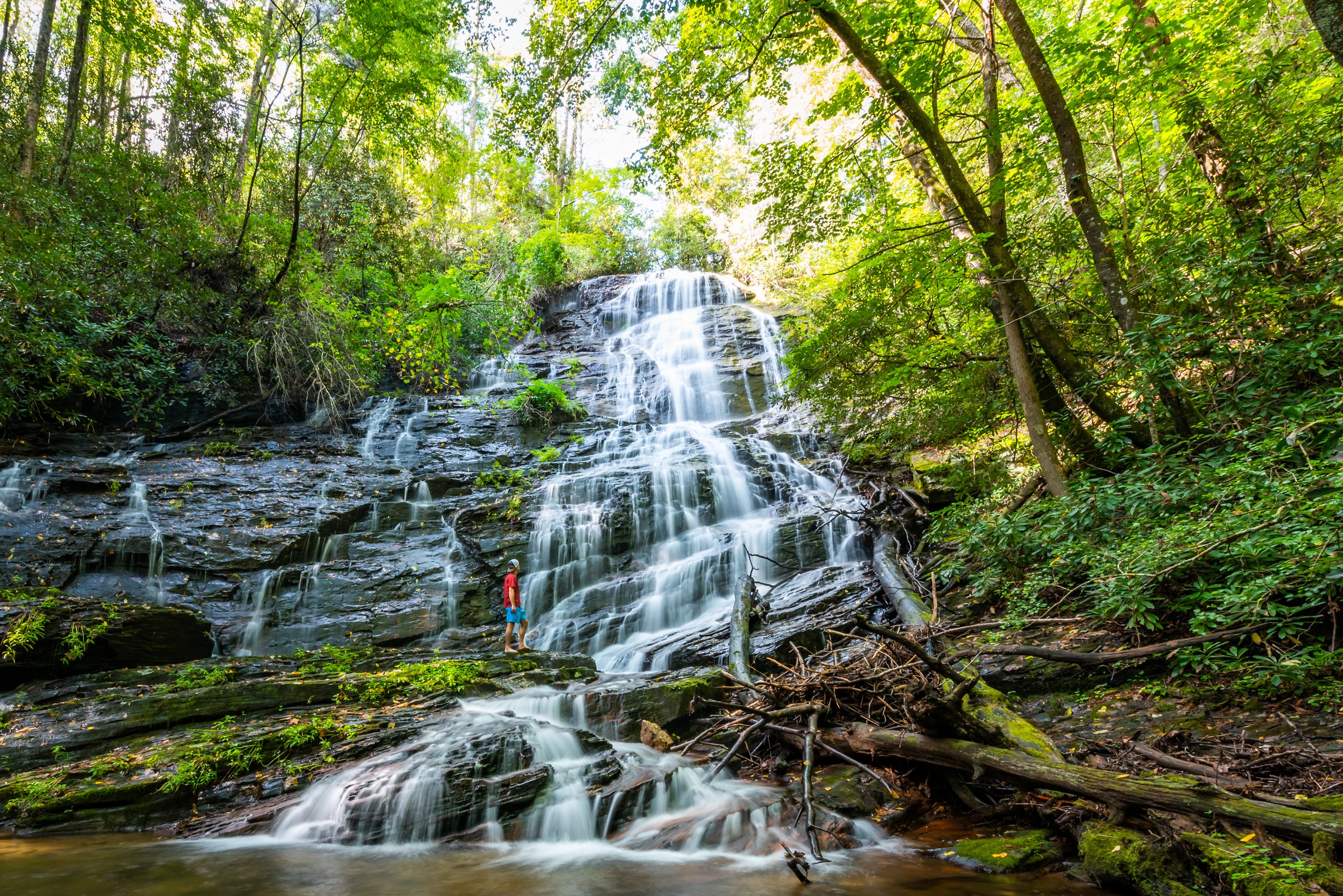
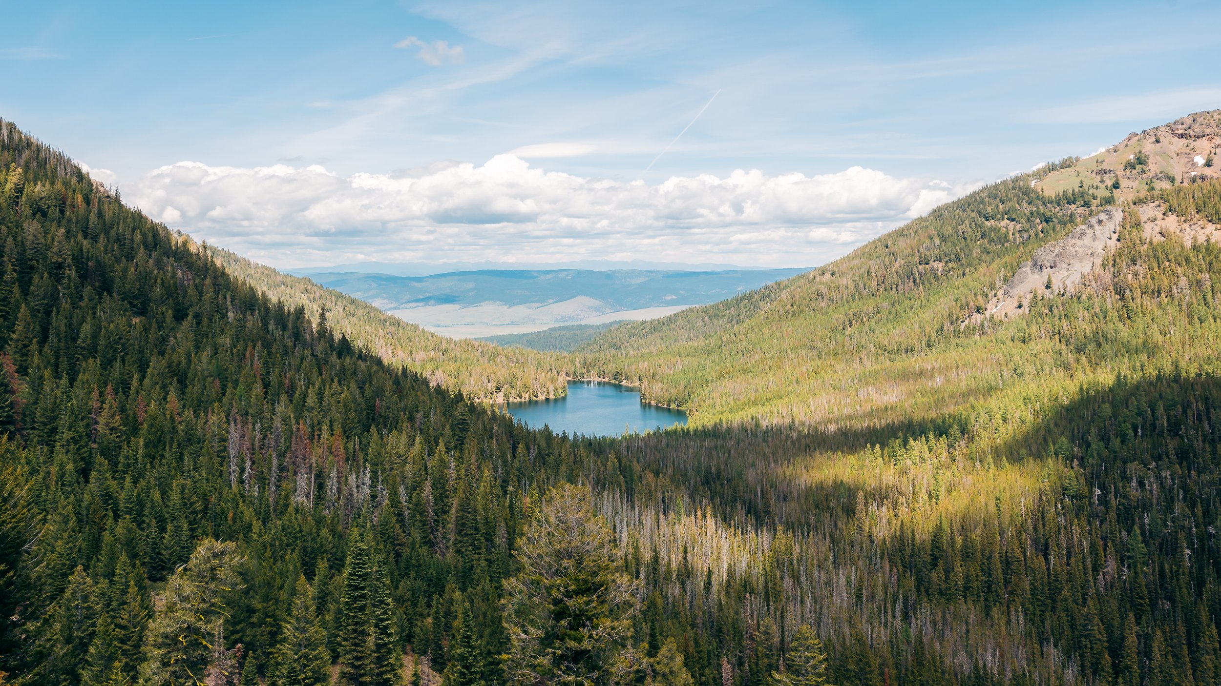
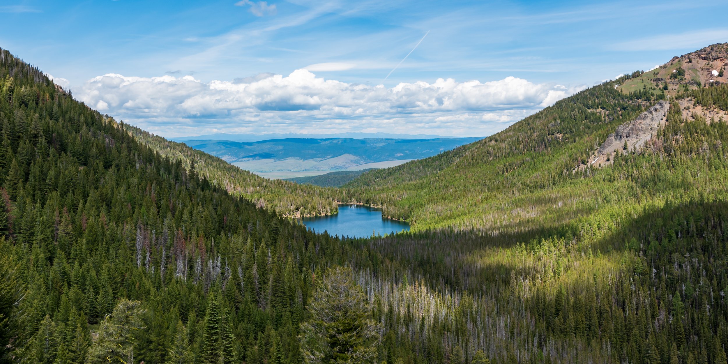
In these first two edits, the changes are subtle. The primary change seems to be a separation in the greens and the yellows as well as an even more notable reduction in the harsh contrast and punchy black tones in the original edits. I find the newer version easier to look at.
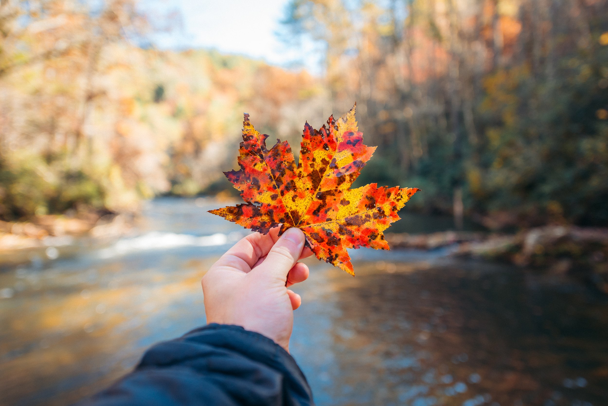
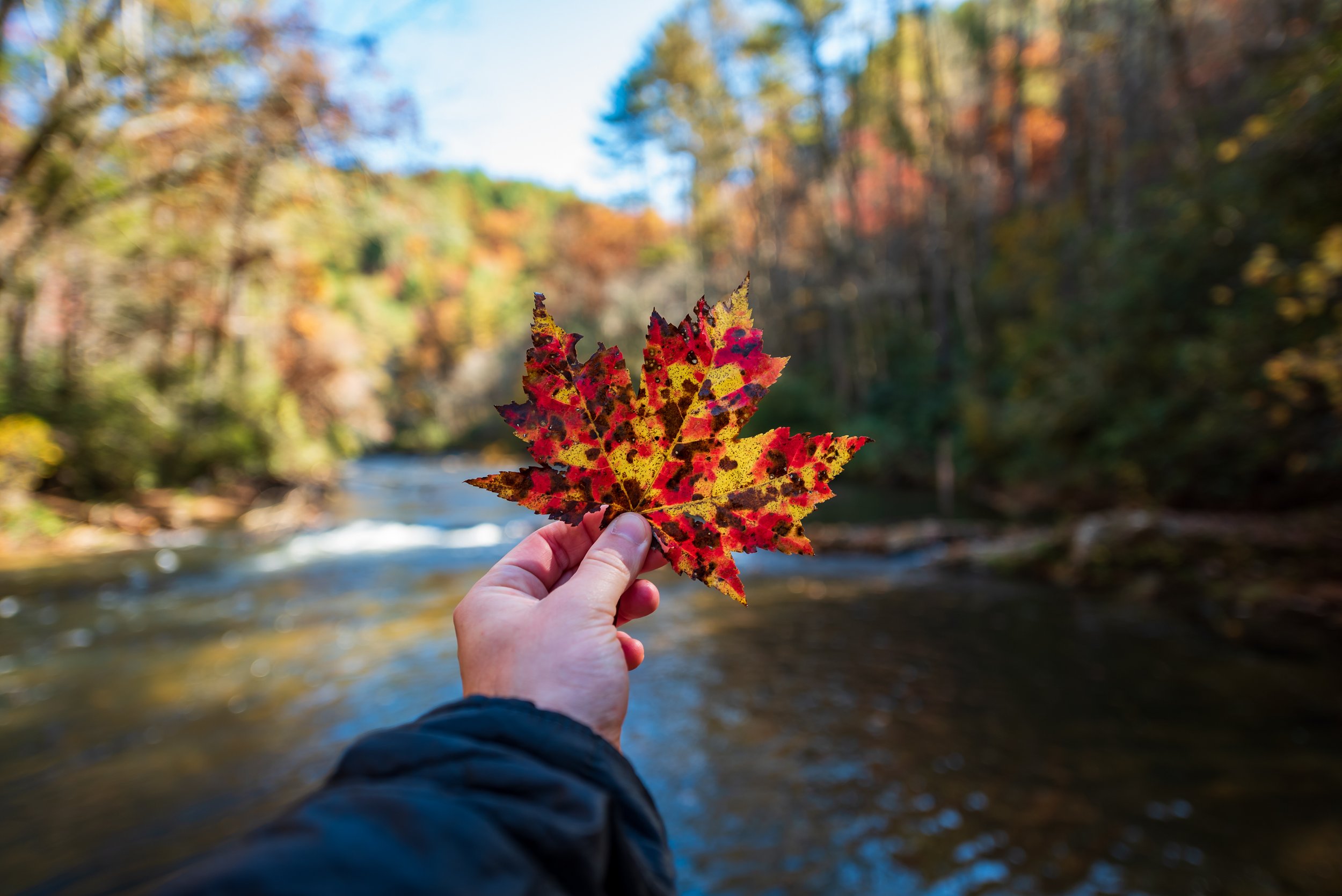
The obvious difference in the previous two images is exposure. The extra light makes such a difference in both photographs. Saturation of the orange and yellow tones in both of these images have also been emphasized without being overdone.
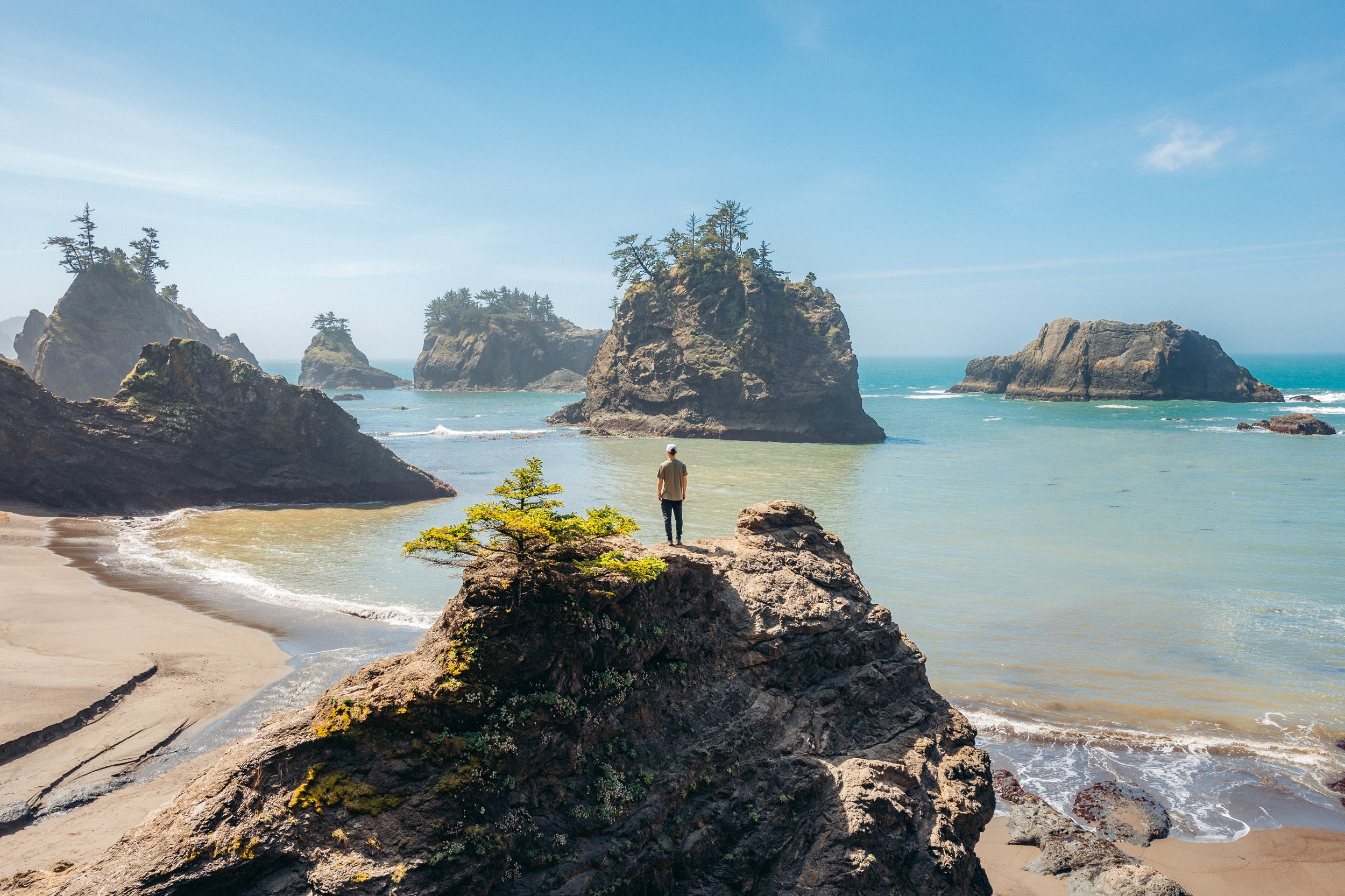
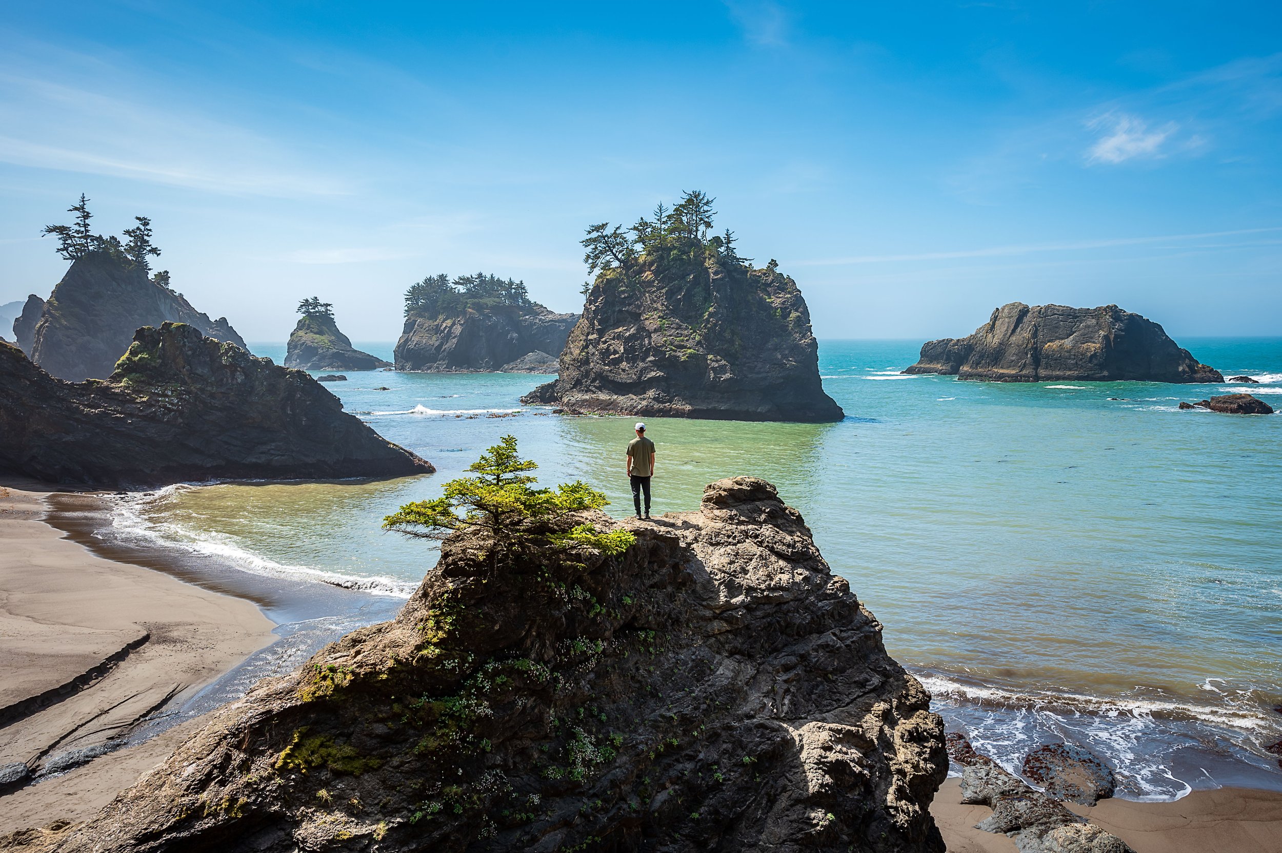
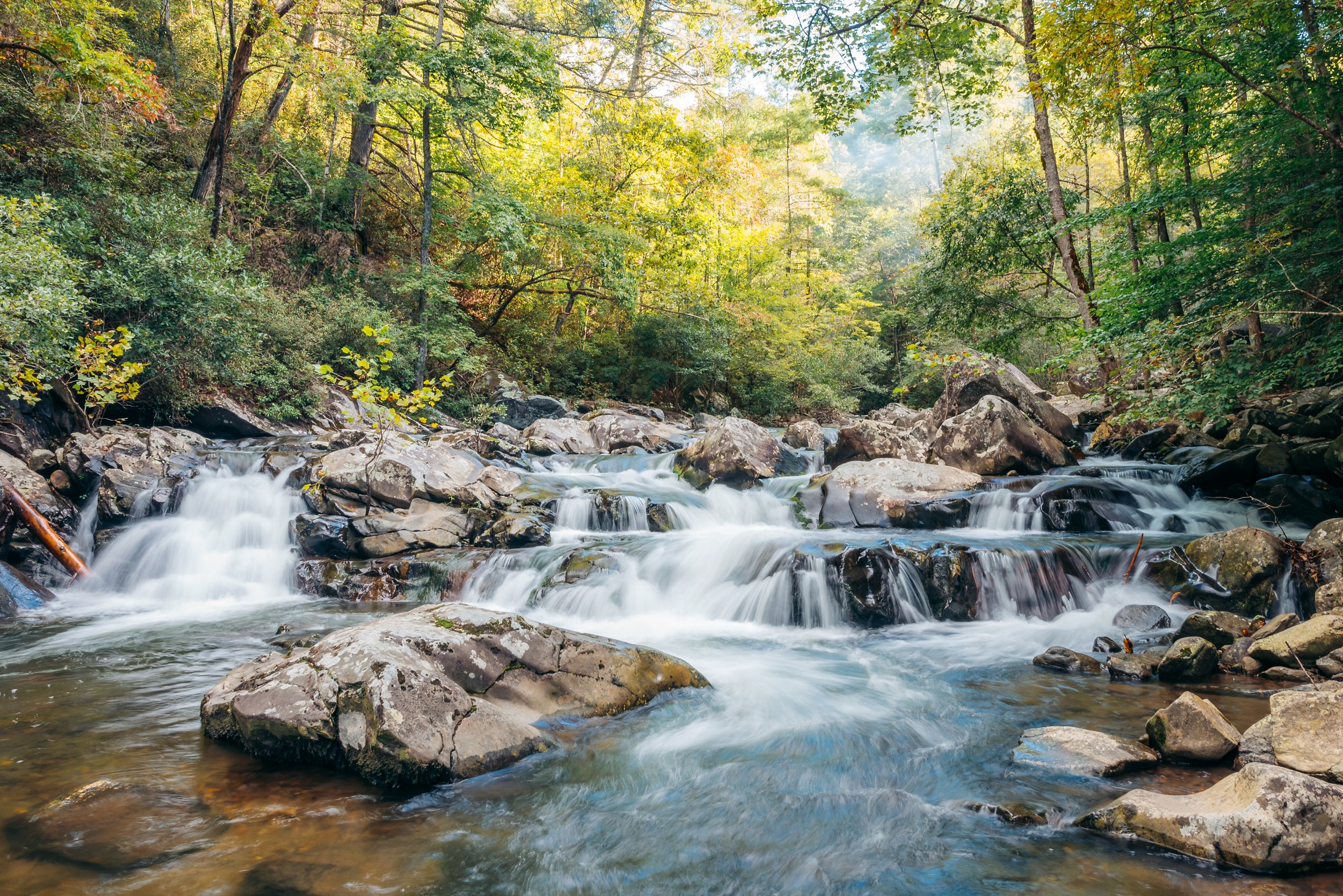
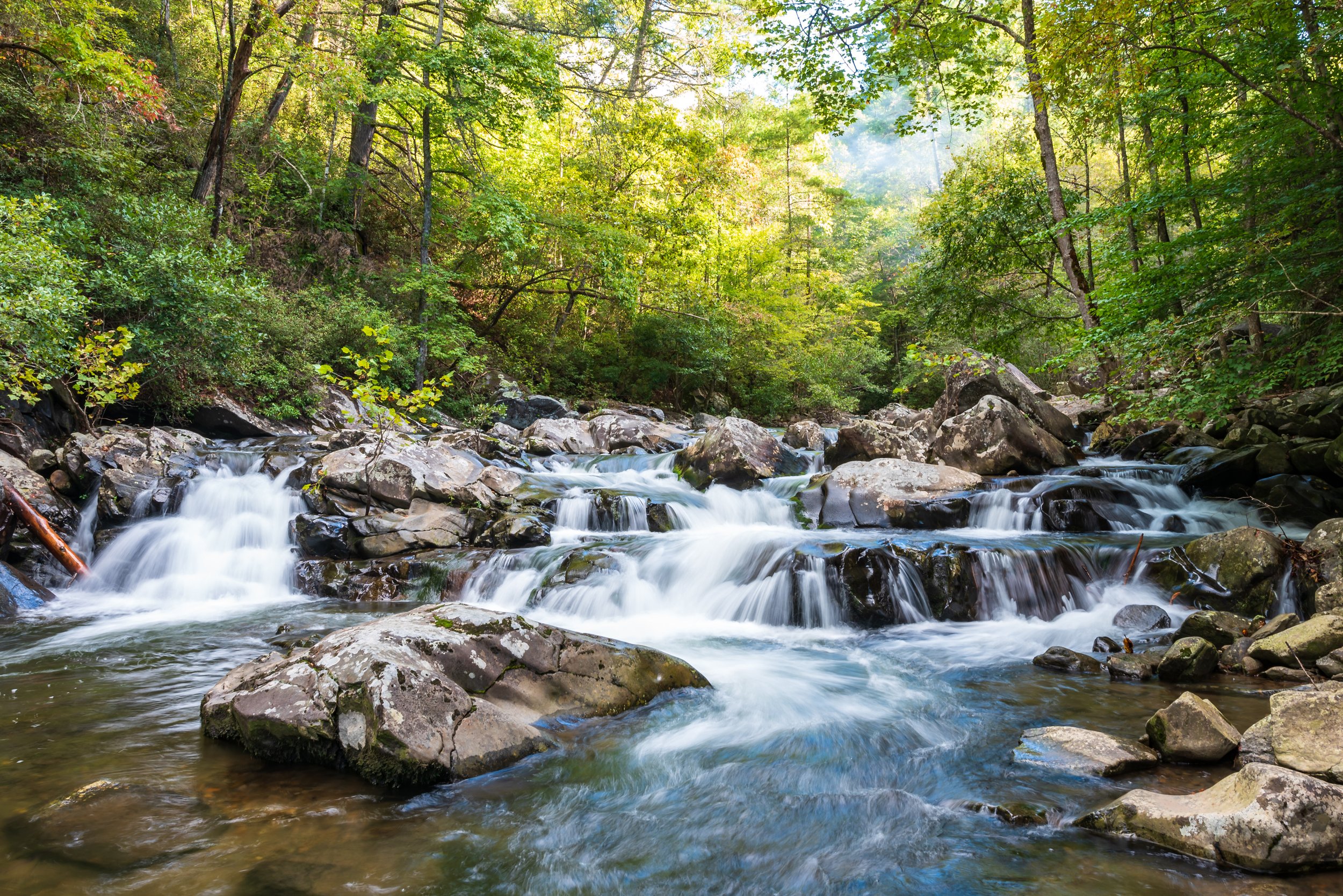
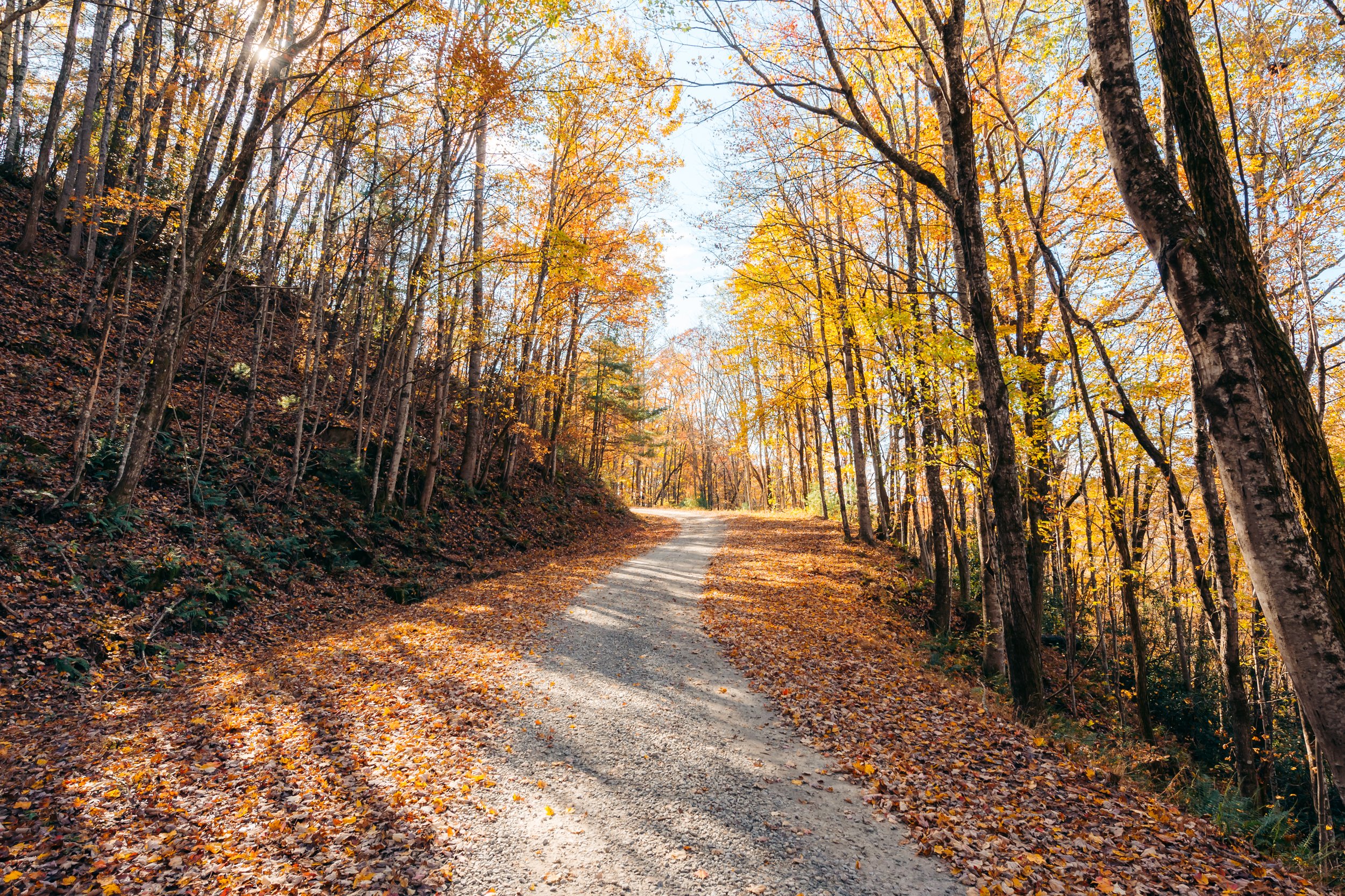
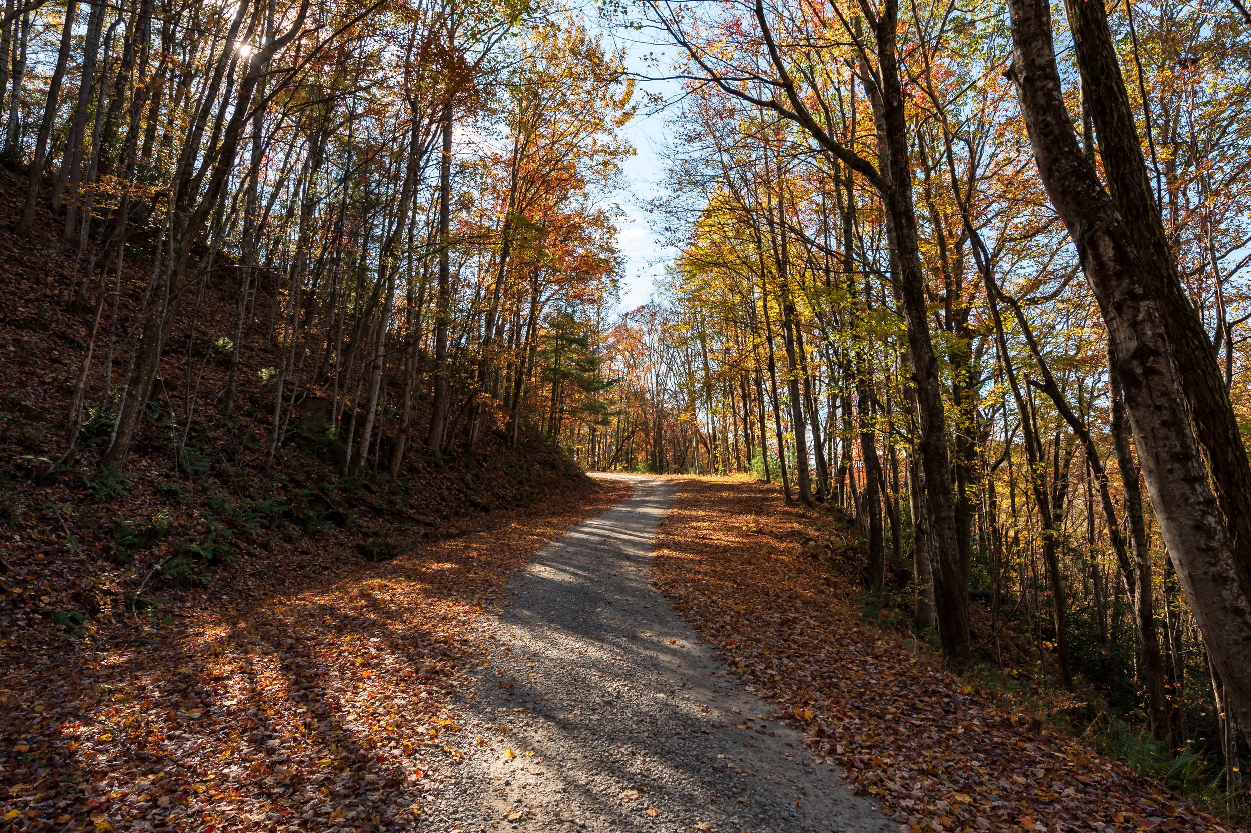
The final two images emphasize the relationship between blue and green. Blue and green have long been the two most difficult colors for me to edit and two of the primary colors for which consistency matters significantly for developing an editing style as a landscape photographer. Blue skies can easily become overwhelming to the viewer, and a poor green edit can be difficult to look at as well. In the recent edits, the blue tones are desaturated to take the emphasis off of the sky, and again a separation between green and yellow and a slight desaturation of greens helps the viewer focus on the scene, light, and composition rather than an intensity of color.